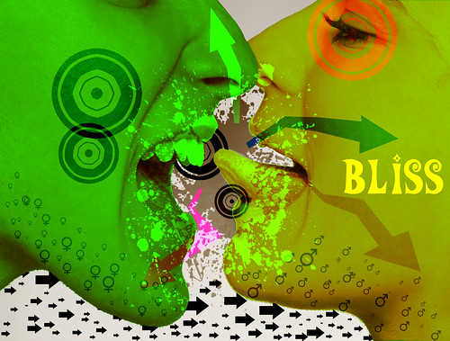
The first of hopefully a couple posters for club Bliss. This is rough and essentially a study of a larger idea. as always click to view the entire image. Edit: apparently there was a christmas theme that i dident know about... damn?
This black and white digital photograph titled “Sheep” by Jeff Bell is, in my opinion, extremely successful. Though the picture was shot with a Nikon D80, Jeff’s clever post-processing gives the photograph a vintage feel. The use of lines and balance in the shot is also very impressive. The human eye naturally reads pictures from left to right and the subtle leading line provided by the point where the ice meets the grass directs the viewer toward the group of people. Successful use of ISO is seen in the detail and vividness in the fog as well as the ice. Though it is evident that Jeff dodged the people so that they would stand out more against the dark background, the post processing does not negate anything from the shot. The subtle use of symmetry in the reflections is ultimately what makes this photograph successful. Finding the clean patch of ice and capturing the picture just as their reflections can be seen is no easy feat, however, Jeff accomplished this and as such created a captivating picture. My only major critique of this shot is the over exposed spot in the sky. I realize this may have been hard to avoid but perhaps a different ISO or cleaver angles could have prevented it. Anytime a picture contains absolute white it should try to be treated in post processing. Also perhaps tweaking the levels and curves slightly may brighten up the shot a tiny bit, bringing out the detail and “grunge” that make this shot so interesting. The boarder lends itself well to the shot and actually does more than just contain it. Instead it draws the viewer in and definitely adds something. Overall great shot. The title “sheep” is very thought provoking. I would love to see this shot as part of a series and hope to see more from this artist soon.
Advertisement critique The add I chose belongs to the web hosting and business trading cooperation, “DigitalDay”. While the add gets the point across effective I feel that it lacks the originality needed in order for me to consider it a “standout add”. However, what it lacks in originality it makes up for with clean, crisp, and simple ascetics. The first thing that I notice when looking at the picture is in fact the smaller dogs. While my eye might naturally fall upon the larger darker animal, I immediately follow its gaze down to the smaller more pathetic dogs. I do this so quickly that I do not take the time to consider the larger animal until I have spent some time looking at the more squat ones. Also this effect may be attributed to poor planning on the designer’s part. The eye naturally reads left to right and as such the subject should have been framed to the left. However, there may also be very subtle and purposeful planning behind this choice of off balance in the picture. Because the eye reads left to right we end up fully considering the larger dog last, this may be intentional as in this way the dog serves as a visual punch line and as such the company that it metaphorically represents is remembered more and more prominently than the smaller animals (their competition). The dark to light spotlight gradient in the background servers to add a sense of direction to the picture and to help make the already noticeable dog even more prominent. However, this is wear the advertisement begins to lose value. Simple poor processing caused the gradient to end abruptly in a straight harsh line. Instead of choosing to fade the cut off point between the stock photograph and the text beneath, they chose to simply place the photograph and add the text. The lack of integration between the top and bottom halves of the picture greatly detracts from the overall effectiveness of the advertisement. The text bellow the picture is essentially an explanation of the metaphor and as such detracts from the “punch” of the add. Without the text the viewer would feel slightly more engaged because of their effort to understand the meaning of the advertisement. The semiotics of the advertisement is effective. The image (and idea) of one larger dog compared to the group of smaller silly looking dogs inherently makes the viewer feel that the larger dog is obviously better, and transitively the company is better. Also the fact that it is one solo dog against a group of dogs conjures the idea that the company rises above the pack and in this case the competition and stands out as the best. The advertisement is effective. However, the inclusion of the “us,them” words detracts from the “punch”, the picture gets the message across and catches the eye of the viewer, and in the end, that’s the point.
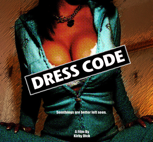
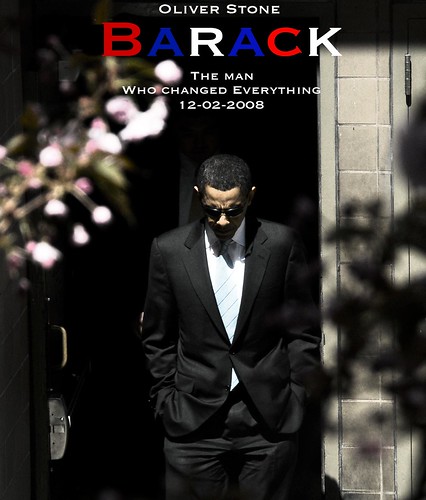
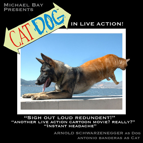
Movies that I conceived and or am satirizing and the posters that would advertise them. Please click on the picture for the full view.
This piece by Salvador Dali displays several key elements of design. Some of its most appealing features beyond simply the imaginative “wiggle” room it offers, is the interesting contrast not just in color but also in ideas. Not only does Dali contrast the pale subhuman form against a dark background, but he also contrasts the clocks against the solid tree and brick. It is known that Dali was very interested in the relationship between hard and soft. The picture itself also offers a sense of balance. On the left hand side there is a lot to look at, colors, shapes, even actions are the first thing our eye sees. However, the right hand side of the frame is dominated by the heavy color black, and large stone cliffs. In fact, the cliffs are the most detailed part of this painting and thus draws a significant amount of attention. Dali effectively uses several types of contrast in order to build a strong painting. His use of other aesthetic tools are also very interesting. For example the branch servers as a leading line reinforcing the viewer’s natural tendency to read left to right. This is commonly accepted as one of Dali’s best works. Although I would not call it the “best”, Dali was truly a master of ascetics and it is abundantly clear in this visually interesting oil painting.
Balance: The equiliberium between two sides or two parts of a picture. This should not be mistaken with a mirror image as balance does not need to be exact. Instead its job is to balance the “weight” of the parts of the picture. This picture has both man and god on respective sides of the mural. They create a sense of balance in the picture even though it is not a mirror image.
Contrast: The difference between lights and darks. Often used to distinguish an object or subject from their surroundings. Also ideas or themes my contrast. In this Dali Painting, not only does the pale form in the center contrast against the dark background. But the soft clocks also contrast against hard block they are sitting on.
Proportion: Similar to contrast as it helps show a difference between two or more objects. It also helps establish one object even further. It also relates to one objects sizable relation to another. An idea made famous by DaVinci, the human body grows in an equal proportion to itself. This bolster’s the idea of things being geometric by nature.
Pattern: Usually associated with a reparative geometric pattern. the tiles are almost all exactly the same and together form the larger circle. the identical tiles form a pattern.
Rythem: Very similar to patterns, however, it is less geometric and exact. It does not have to be proportionate or balanced. It is simply an object or series of objects in repetition forming a trend. The different spikes of inc form less of a pattern, and more of a rhythm as they progress across the page. It gives a sense of movement and helps direct the eye.
Emphasis: Sometimes the goal of the previous techniques. Emphasis is an attempt to draw attention to a specific part of the piece. The leading lines as well as the high contrast of color draws immediate attention to the mans face.
Unity: A sense of place and consistency in art. even though these women’s dresses are different color they all have place in the picture to create the overall effect.
Varity: The use of change to empower the subject. among all the color and chaos the solid white block draws the viewers attention immediately to the man walking down the street.
Lumiere Films My favorite Lumiere film that we watched in class was by far Beauty and the Creep. It was funny, entertaining, and well shot. The low angle camera drove the voyeuristic theme, which is inherent to a Lumiere film. The rule of thirds was followed almost religiously, which made it very visually pleasing. The situation may have been slightly exaggerated which added to the entertainment but ultimately detracted from the Lumiere esq intentions. One part that particularly stood out was when the main subjects head went off screen slightly adding the voyeuristic feel of the camera. Making this short film was interesting to me because there was very little “making” involved. I simply set my camera on a chair to give it a lower and slightly skewed angle, and began filming. The most difficult part of production was convincing myself to hit my head against a steel bar… After the footage was imported all I did was desaturate clip adjust the levels, contrast, and curves to get the tonal values I wanted, and add music. Though adding music detracted from the Lumiere style, I thought it greatly added to the piece and helped set a sense of pace and purpose. Also keeping the audio allows the viewer to hear the “clunk” of my head hitting the bar, which adds to the sensory experience and the impact of the moment. In hindsight I wish that better lit the roof of the bunk so that it would be more visually obvious what I am hitting. Watching the video in class did not bother me though I wish we had more time to turn the viewings into critiques and get feedback from our peers. (Though that’s probably the art class talking…)
My ideas about the various design elements that riddle Japanese Modern Culture: (I will try to put the pictures in as soon as my photo hosting website is back online... sorry for now) they are in the hard copy.
Since I was very young Japanese Culture has been very interesting to me. The various forms of design vary greatly and there are interesting contrasts riddled throughout the culture. From Japanese architecture to television, they celebrate both sides of the design spectrum equally. From chaotic and “insane”, to extremely organized and simple, various aesthetic approaches are taken throughout the culture. Currently Japan is one of the world leaders in technological development. This world position is very obvious when looking at almost any Japanese structure. The ultra affordable, efficient, and clean governmentally appointed housing:
is an excellent example of this approach.
Though simple and seemingly very western, the sheer use of space is astounding. An average Japanese apartment building houses twice as many tenants than its American counter parts (in ratio) this resourcefulness is a common theme throughout Japanese culture. The incredible and borderline “whacky” Capsul Tower Hotel (which is scheduled for demolition):
The idea of controlled chaos permeates Japanese culture. While it is commonly found in entertainment this archictural structure reflects it. It makes amazing use of space, contrast, balance, points and lines. Also it emphasizes proportion and unity. These design elements show themselves in other places in the culture as well. The breath taking Umeda Sky building in Osaka is a great example of this:
Finally this massive tower demonstrates the Japanese trait of form vs. function and the balance there in. These massive towers visual make amazing use of lines, texture, balance, and form. If similar buildings were built in America at a similar time they would undoubtedly be much more concerned with function and as such lose the beauty. Japanese architecture is an extremely interesting balance between chaos and simplicity. Also they greatly appreciate both sides of the balance between form and function. This can be seen in many of their technologies. The Honda Car is a great example of a beautiful, efficient, cheap, and reliable car. It gets very high gas mileage as well as maintaining the sleek and sexy design, which consumers seem to expect of modern cars:
Japanese cars make outstanding use of balance, lines, and curves. Also movement obviously places key rolls in the designing of cars. However, again the Japanese seem to balance form and function perfectly and that is why they are one of the leading car manufacturers.
However, on the flip side while the Japanese make incredible use of their recourses and do not waist when it comes to physically constructing something. Excess and chaos becomes very evident in their advertising and entertainment. An example of this is Takeshi’s Castle or as known in the United States “MXC” (Most Extreme Elimination Challenge). This show is utterly ridiculous and in very few ways actually reflects the non-wasteful sleek and organized themes that seem to have defined Japanese culture:
.
This hectic game show uses rapid movement, bright colors, and very little balance to achieve the feeling of utter ridiculous that permeates Japanese entertainment. Interestingly though this may at first glance seem negative, the spectator becomes very attracted and “hooked” on watching this type of television for hours on end. In a since their ideas of form and function parallel the idea that in this case the ends justify the means (the ends being viewers watching, the means being chaos).
This Japanese shirt is also a good example of this organized chaos:
Japan makes excellent use of all different elements of design. The balance, lines, and simplicity that is found in their architecture and technology in many ways contrasts with the chaos, colors, and rapid movement which is found in their entertainment. The idea of excess and waste when it is superficial is very interesting and I believe the Japanese appreciation of this idea may be a key reason to their continued success.
For this critique I chose Elizabeth Lajoie, Amanda Moore, and Matt Mariacher’s film. I really enjoyed the temp as well as some of the more thought out shots. Specifically the long shot and the cut ins, as well as the two shot. There was a good amount of humor, which made the film more fun to watch, and although there was not music the audio was not disruptive. Regarding places to improve I would have liked to see a consistency in the quality of the shots, also a more defined central theme. I understand now that it is wet and dry, however, watching the movie I did not realize this. Also some elements of composition may be improved. For example in the two shot I would have liked to have seen her feet instead of cutting her off at the knees. Regarding my own film, I thought it was a fun exercise that is useful in developing a visually literate eye. I did all of the work behind the camera as in filming and composing shots. However, Laura regardless of having no prior visual art experienced gave valuable insight when she deemed it necessary. Laura also did almost all of the organizing of equipment (renting the camera and getting tapes). We both shared in the editing process. Though I did most of the technical cutting and mixing, Laura helped organize the shot lists and order. She also helped decide the duration of several shots throughout the film. We shot the entire film without a tripod (due to a mix up at the cage) and although it was noticeable at the end during the zoom, it was not a major hindrance in the filming process. In hindsight it would have been more interesting to pick an object that is simply more interesting than a bottle of OJ. However, the simplicity of the object makes the film relatively fun to watch. Also, I wish that I shortened the clips displaying the name of the shots between clips. The showing of my work did not bother me at all. I have taken part in countless artistic critiques in the past, which varied greatly in intensity and “harshness”. I am proud of my work (if I wasn’t I would not have made it) and greatly enjoy sharing it with people. I thought this exercise was very useful as a sort of stretch to help me get back into film making after a summer and several semesters off. Also iMovie has been completely revamped and this served as a useful tool in acquainting myself with this newer version.
The Big Lebowski is an extremely dark satirical comedy. By definition satire has a defined target, however, through the course of the film several different targets are satirized. The nature of the targets of this satire along with the grim yet passive nature of the film is what makes the movie a Dark Comedy. In this scene they are not so much mocking death as pointing out the ridiculous and essentially pointless ways we approach it. The two contrasting characters, Walter and The Dude, create an interesting dynamic that essentially play off each other to deliver this grim satire. After the death of their friend, Walter and The Dude attempt to spread his ashes out across the ocean. When they cannot accomplish even this one simple task The Dude has a “breakdown” and a temporary roll reversal occurs in which The Dude becomes angry and aggressive and Walter attempts to comfort him. This scene is coherent with a larger theme of successful incompetence throughout the film.
Shot breakdown. 1. Medium close up to three shot. 2. Cut out to zoom (still three shot) 3. Zoom to medium close up 4. Cut to medium close up (repeat) 5. Scene break 6. Establishing shot (two shot) 7. Medium two shot close up to long shot 8. Back to medium two shot 9. Cut out to over the shoulder back to medium close up. 10. Cut to medium close up 2 shot to three shot (coffee can) 11. Over the shoulder. Cut to medium close up repeat. 12. Cut to medium shot 13. Scene Mis-En-Scene The Mis-En-Scene that is seen in this clip from The Big Lebowski is very consistent with the rest of the film. Though makeup is not readily noticeable on the characters, their costumes are direct representations of their personalities. Walters’s eccentrically conservative attire reflect him perfectly, while The Dudes laid back bowling garb is a perfect representations of him. The shots themselves are usually very “big and empty”. What this means even though the shots are wide (in this case including a vast ocean and huge cliffs) the only thing relevant are the two characters having a dialogue. The film also makes ample use of the rules of thirds, leading lines, vanishing points, and natural frames. This makes it very easy and fun, easy, and interesting to watch. Though in other scenes the lighting is used to create a specific desired effect. This scene makes good use ambient natural light. This technique is a reflection of the nature of the scene itself.