Monday, December 15, 2008
Production Journal
Proff K.
12/14/08
Visual Litteracy
Production Journal: Gender?
This project was, to say the least, interesting. Though I did not change much from my original idea of gender stereotypes and the reversals there in. My project (and the quality and depth of the shots) improved over the coarse of the entire production.
Going into this final project I was confident that my idea was strong enough that it would carry me to the end. I set up my shots, photographed some models, did some slight touching up in Photoshop, and called it finished. The pictures that I took were relatively strong and I was as happy as could be expected. However, due to (what I know find out) a virus that has been spreading on the popular networking site “Facebook”, my computer crashed and all data, which was not properly backed up, was erased. Luckily, I do use an external hard drive to keep most of my work safe, however, the recently finished photo project was not saved to the external and in turn was destroyed.
After a solid amount of complaining and feeling sorry for myself I decided to view this disaster as a blessing (at least as much as I could manage without inflicting bodily harm to myself). Because of this unique situation I was given in which I could remember my essential “rough draft” and as such go back and improve, I was able to create a, in my opinion, very strong final project.
Preparation
My idea for this project originally came from a speaker who I saw in my Visual Literacy class who discussed the changing roll of women in today’s modern society. This idea sparked a larger one regarding gender rolls in general. I began to question why are certain things considered masculine and others feminine. Are we not all human beings performing simple acts? This is the question that essentially drove my project.
Devising the shots was not difficult. I sat down with my models and began brainstorming and writing down various acts that are stereotypically male and female. We then chose what we thought would go together best in a short series and which gender should take which roll.
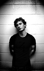
I thought it would be most effective if I were to portray three shots of each model. The first shot would simply be a portrait, which showed the man or woman completely removed from any act and simply posing for the camera. This approach sets up the viewer to then look at the following shots in a more appreciative manor.
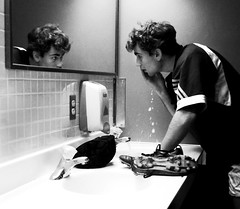
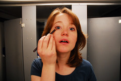
Following the first shot I decided to use the “gender stereotype” photograph. This eases the viewer into the third shot as it is not foreign and helps them get acquainted with the subject and hopefully allows them to relate to the picture. In my project the girl is putting on makeup and the boy is preparing for a rugby match.
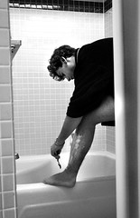
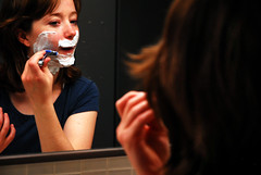
The third shot is meant to display the subject in a gender roll reversal. In other words they are assuming a stereotypical action usually taken by the other sex. In my project the girl is shaving her face while the boy is shaving his legs.
Production
In all honesty, this project was an absolute blast to shoot. Because I did not want to approach this through voyeurism or a photojournalistic I was able to interact and direct my models as I thought best. This allowed me unprecedented control over the shoot and ultimately let me “paint” the picture I had in my mind.
Lighting was not a major issue as the ambient light I found was relatively bright. However, I did use flashes and desk lamps to compensate for lighting that I thought could be improved. Needless to say working with mirrors and multiple flashes proved to be an interesting, but fun, challenge.
One thing that I could have done differently in my shoot is allowing the model more freedom to “play”. Because I was working with amateur first time models I found myself directing them more than I wanted to. However, after they felt more comfortable in front of the camera they seemed to open up much more. one thing that I think I did well was make sure the model was comfortable. From past experience I know that an uncomfortable model is a bad model. For example I made sure to bring an extra dry towel for the girl after she put the saving cream on her face, I also bought a brand new razor and blades for the two different shoots. I found that originally the girl was relatively uptight about putting on makeup on camera as this is general a privet action. However, after some joking and kidding (including me putting on some makeup to make her laugh and help her relax) I found that she was able to stare into the camera in almost the exact same way she would a mirror. This model and photographer is extremely important and I believe plays largely into the quality of the shots.
Postproduction
The postproduction for this project was relatively simple. I sorted through the 300 some digital images I captured on the different shoots and, in essence, chose the best. From an album in which I put all potentially good pictures I chose 6 of the strongest (1 for each “chapter” of the 3 shots per gender). One by one I then exported and edited these shots in the Adobe program, Photoshop.
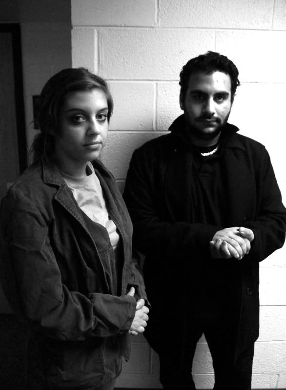
I found that the male pictures seemed to have more of an impact in black and white, while the female shots lent themselves more to color. In hindsight I believe that this was because the female face is general more full of color than a males. Men tend to have rougher tougher skin and as such black and white tends to extenuate the “grittiness”.
Interestingly, I found that the shots of the female subject required substantially less postproduction than that of the male to achieve what I was after. Her colorful blue eyes and red hair really came out well in camera and as such were better off left alone. However, the male pictures allowed me much more room to “play” using levels, curves, and the channel mixer I was able to bring out some very strong (and gritty) black and white tones. After the base tones were laid I went in with the dodging and burning tools and accented specific parts of the shots. This workflow does not vary much from my usual methods, and I have found it to be the most effective in maintaining photographic integrity (not altering any truths) while also bringing an emotional pull to the pictures.
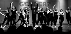
The cover shot with the word “Gender?” required a relatively simple process to create. After doing the above black and white techniques I then added the text on a layer above the dancers. I then created a layer mask and with the brush tool painted out the dancers hands so they would display on top of the text. I then decided for aesthetic purposes that the text should be at around 40% opacity. I think this shot makes a strong introduction to the 6 shots the follow.
I have found post processing to be a very serious (borderline spiritual) act for me. Through it I develop a sense of clear awareness for my final goal and very rarely do I “stumble” upon something I like. The strange connection between the photographer and the model is never clearer then when the photographer essentially changes the subject to be what he or she wants. However, this is never my goal. Instead, through post processing I simply look to bring out what is already there as I have resigned myself to the idea that there are very few things I can do better than nature.
Conclusion
Overall this was an amazing experience. From the first shot to the last I learned something. From backing up your work to model interaction I feel that this project helped me grow as a photographer. In my proposal I mentioned creating a shot or two that could find a place in my portfolio, however, it is my belief (as I hope it is yours) that any one of the shots in this project are strong enough to stand on their own and as such find a place in my portfolio.
The though and idea of gender rolls, stereotypes, and the reversals there in is an interesting one. Though our society does not immediately recognize the pressures it puts on individuals, I hope the projects like my own will at least spark a thought in peoples minds and raise some sort of awareness of the borderline ridiculous nature of these standards.
Thanks for the opportunity to pursue such an interesting topic and the freedom to do with it what I did.
Topic Proposal
Proff K.
12/05/08
Visual Literacy
Project Proposal: Comparative Gender Reversal
For my Visual Literacy final project I propose a photographic project. The topic of this short photo essay would be “Gender Reversal”. By this I do not intend to embrace the borderline cliché idea of “guy dressed up as a girl” (or vise versa). Instead, the goal of this project is less physical and more situational.
I will attempt to shoot pictures of things that are stereotypically gender bias (or have been in the past), and turn them around. I feel that this is a more realistic interpretation, representation, and depiction of the various pressures that surround modern day gender identity.
What does it mean to be “male”, or “female”. Are there specific acts that boys and girls need to perform to be considered their gender? Obviously on a physical level no, however, on a deeper more psychological level? Possibly.
Some shots that I have already begun to construct and consider are as follows:
1. A man shaving his legs, something that is generally performed by girls and in modern society considered relatively feminine.
2. A woman opening a door for a man.
3. A woman Shaving
4. A man putting on makeup
5. A woman helping a man into his seat.
6. A woman paying for both movie tickets.
7. A group of men seemingly going to the bathroom together.
8. A man crying as he watches a movie.
Though I feel that shots of this nature would be very successful, I also believe that there is a level to this project, which would add even more dimension to the final set.
While displaying simply gender reversals would work as a set I believe that I could achieve a more striking final set if I show both sides of the pressures set in place by our society.
By this I mean I will attempt to show one single portrait shot displaying the subject in their most raw uninfluenced form. Then I will show the subject performing a role which is generally associated with the opposite gender. And finally I will show a picture in which that person is performing an act, which typically belongs to their sex. The order of these shots is not set in stone in my mind and is still subject to change.
All the shots will be set up (unless the opportunity presents itself in which I can shoot a none posed picture) the project will total between 6-8 very strong B&W pictures, as well as color images (possibly black and white for one sex and color of the other?) and they will be displayed in a linear slideshow format on the projector (as to achieve the best presentation to the class as far as lighting, color, and contrast goes). Also a slideshow ensures that the pictures will be viewed in the order they are meant to be seen.
Over all I really look forward to starting this piece. I think it will be strong and I hope to take some shots from the shoots and keep them as part as my portfolio.
Thanks professor and I hope to hear back from you regarding this!
Wednesday, November 19, 2008
Wednesday, November 12, 2008
Susan Sontag Critique
While I agree with Sontag on the point that photography is becoming more and more available to the masses, I do not necessarily agree that this is a bad thing.
In her essay she uses the example of the pyramids and how prior to photography, only people who have traveled to Egypt can truly appreciate what they look like. Though this may be the case, however, why should this privilege be so exclusive?
Sontag herself is an interesting character. Though she criticizes modern photography she hold a very close relationship with one of the worlds best photographers, Annie Leibovitz. Perhaps this relationship gives her a perspective on photography that actually photographers cannot understand. Sontag herself has never done anything notable in the field of photography and as such can (ironically) be compared the leaders of modern conflicts such as proposition 8. Though she has never personally experienced the institution, which she is criticizing, she criticizes all the same.
Though Sontag is right in saying the photographic medium is becoming extremely saturated. She is not right in saying this is a bad thing. A more visual and available the world is only a good thing. Letting people experience things, which they otherwise would not be able to only help develop a closer global community, which I would argue is without a doubt a good situation.
Henri Cartier-Bresson
I have always been a big fan of Bresson’s photography. The very raw and true to life style is both appealing and honest. Since I started shooting years ago Bresson has been an inspiration to my work.
His work is very unique. Though he was by most standards a “photojournalist”, Brasson had the ability to turn otherwise average looking moments and scenes into compositional dreams. He emphasized the subjects in his work even more so than the moments themselves. Bresson was one of the first to do this, and to this day he is considered one of the best.
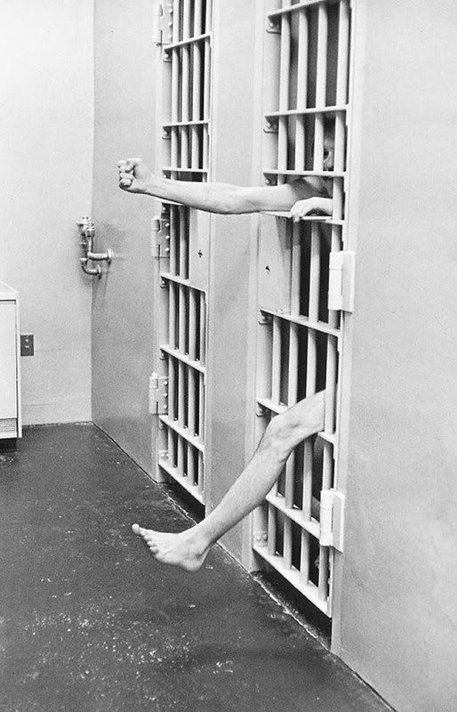
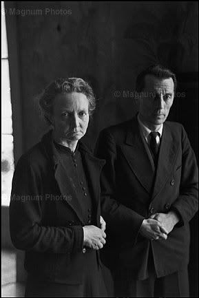
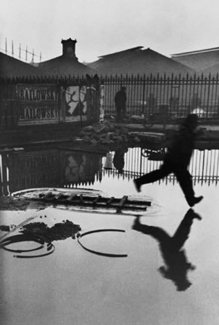
From National Geographic Museum: Comparing Alejandro Chaskielberg and Luis Marden
Luid Marden explored revolutionary underwater color photography techniques as well as the use of Kodachrome in small 35mm cameras. The idea of accessible color photography was still new, however, Marden pioneered the technique with National Geographic and soon it became the standard.
The comparison is easily drawn to Alejandro Chaskielberg, a young photographer from Argentina. Though his new techniques stand in contrast with Marden’s as they are essentially making the photographic experience more complicated and larger in scale. They type of shot that Chaskeielberg produces has rarely been seen before. Through the use of layered flashes and what appear to be various layers of focus, (whether this is HDR I cant tell for sure, but I don’t think it is) Chaskielberg creates stunning, intimate, and almost studio quality photographs on the fly.
Though the nature of the pictures that both these talented photographers took vary greatly. Chaskielberg seems to prefer photojournalistic shots of people and action and Marden was more of a landscape photographer who routinely shot pictures of still life’s and inanimate objects, both men offered the world very exciting photographs.
The first photograph shown is by Alejandro. It makes extremely effective use of selective lighting, blurring and even de-saturation to draw the viewer’s eye directly to the subject. Examined closely you can even see that there appears to be various layers of focus. In other words the leaves in the foreground are in focus, then those behind them become blurred, however, then again as the eye goes further back and lands on the girl she is again in focus. One way he may have accomplished this is shooting the image with around a 22f stop then selectively blurring in post processing. It also may be a technique similar to HDR where this is actually a composite of several images.
The bottom image belongs to Marden. While it uses less technical and complicated photographic techniques the similarity between the two shots is very intresting. Marden also seems to shoot at a higher aperture setting (probably 8). This way he keeps the entire scene in focus instead of just one man. The foreground of leaves, like in the former shot, help establish the scene and create depth and transitively space. Also though it may not seem impressive now, Marden was one of the first to use a 35mm Kodachrome. In essence if he did not use this type of camera and instead chose the standard large format camera on a tripod etc. He may have made his subjects more aware of him and ultimately may not have captured the shot.
Both men engaged in exciting new techniques, which are beneficial to the photograph. 35mm color photography caught on like wildfire, however, the advanced flash and exposure techniques that Chaskielberg engages in are less accessible and as such may be less likely to grow in popularity. However, both revolutionary ideas are what define these two men as the great photographers they are.
Wednesday, October 29, 2008
Bliss Poster
Photo Critique
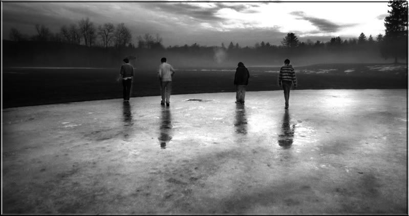
This black and white digital photograph titled “Sheep” by Jeff Bell is, in my opinion, extremely successful. Though the picture was shot with a Nikon D80, Jeff’s clever post-processing gives the photograph a vintage feel.
The use of lines and balance in the shot is also very impressive. The human eye naturally reads pictures from left to right and the subtle leading line provided by the point where the ice meets the grass directs the viewer toward the group of people.
Successful use of ISO is seen in the detail and vividness in the fog as well as the ice. Though it is evident that Jeff dodged the people so that they would stand out more against the dark background, the post processing does not negate anything from the shot.
The subtle use of symmetry in the reflections is ultimately what makes this photograph successful. Finding the clean patch of ice and capturing the picture just as their reflections can be seen is no easy feat, however, Jeff accomplished this and as such created a captivating picture.
My only major critique of this shot is the over exposed spot in the sky. I realize this may have been hard to avoid but perhaps a different ISO or cleaver angles could have prevented it. Anytime a picture contains absolute white it should try to be treated in post processing.
Also perhaps tweaking the levels and curves slightly may brighten up the shot a tiny bit, bringing out the detail and “grunge” that make this shot so interesting.
The boarder lends itself well to the shot and actually does more than just contain it. Instead it draws the viewer in and definitely adds something.
Overall great shot. The title “sheep” is very thought provoking. I would love to see this shot as part of a series and hope to see more from this artist soon.
Wednesday, October 22, 2008
Semiotics in Advertising
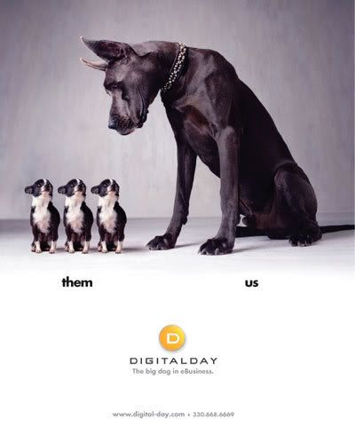
Advertisement critique
The add I chose belongs to the web hosting and business trading cooperation, “DigitalDay”. While the add gets the point across effective I feel that it lacks the originality needed in order for me to consider it a “standout add”. However, what it lacks in originality it makes up for with clean, crisp, and simple ascetics.
The first thing that I notice when looking at the picture is in fact the smaller dogs. While my eye might naturally fall upon the larger darker animal, I immediately follow its gaze down to the smaller more pathetic dogs. I do this so quickly that I do not take the time to consider the larger animal until I have spent some time looking at the more squat ones. Also this effect may be attributed to poor planning on the designer’s part. The eye naturally reads left to right and as such the subject should have been framed to the left. However, there may also be very subtle and purposeful planning behind this choice of off balance in the picture.
Because the eye reads left to right we end up fully considering the larger dog last, this may be intentional as in this way the dog serves as a visual punch line and as such the company that it metaphorically represents is remembered more and more prominently than the smaller animals (their competition). The dark to light spotlight gradient in the background servers to add a sense of direction to the picture and to help make the already noticeable dog even more prominent.
However, this is wear the advertisement begins to lose value. Simple poor processing caused the gradient to end abruptly in a straight harsh line. Instead of choosing to fade the cut off point between the stock photograph and the text beneath, they chose to simply place the photograph and add the text. The lack of integration between the top and bottom halves of the picture greatly detracts from the overall effectiveness of the advertisement.
The text bellow the picture is essentially an explanation of the metaphor and as such detracts from the “punch” of the add. Without the text the viewer would feel slightly more engaged because of their effort to understand the meaning of the advertisement.
The semiotics of the advertisement is effective. The image (and idea) of one larger dog compared to the group of smaller silly looking dogs inherently makes the viewer feel that the larger dog is obviously better, and transitively the company is better. Also the fact that it is one solo dog against a group of dogs conjures the idea that the company rises above the pack and in this case the competition and stands out as the best.
The advertisement is effective. However, the inclusion of the “us,them” words detracts from the “punch”, the picture gets the message across and catches the eye of the viewer, and in the end, that’s the point.
Wednesday, October 15, 2008
Elements of Design: The Persistence of Memory.
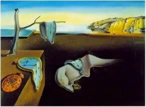
This piece by Salvador Dali displays several key elements of design. Some of its most appealing features beyond simply the imaginative “wiggle” room it offers, is the interesting contrast not just in color but also in ideas. Not only does Dali contrast the pale subhuman form against a dark background, but he also contrasts the clocks against the solid tree and brick. It is known that Dali was very interested in the relationship between hard and soft.
The picture itself also offers a sense of balance. On the left hand side there is a lot to look at, colors, shapes, even actions are the first thing our eye sees. However, the right hand side of the frame is dominated by the heavy color black, and large stone cliffs. In fact, the cliffs are the most detailed part of this painting and thus draws a significant amount of attention.
Dali effectively uses several types of contrast in order to build a strong painting. His use of other aesthetic tools are also very interesting. For example the branch servers as a leading line reinforcing the viewer’s natural tendency to read left to right.
This is commonly accepted as one of Dali’s best works. Although I would not call it the “best”, Dali was truly a master of ascetics and it is abundantly clear in this visually interesting oil painting.
Elements of Design
The equiliberium between two sides or two parts of a picture. This should not be mistaken with a mirror image as balance does not need to be exact. Instead its job is to balance the “weight” of the parts of the picture.
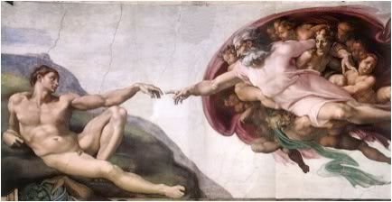
This picture has both man and god on respective sides of the mural. They create a sense of balance in the picture even though it is not a mirror image.
Contrast:
The difference between lights and darks. Often used to distinguish an object or subject from their surroundings. Also ideas or themes my contrast.

In this Dali Painting, not only does the pale form in the center contrast against the dark background. But the soft clocks also contrast against hard block they are sitting on.
Proportion:
Similar to contrast as it helps show a difference between two or more objects. It also helps establish one object even further. It also relates to one objects sizable relation to another.
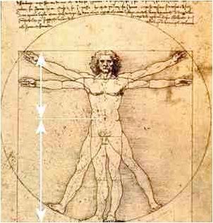
An idea made famous by DaVinci, the human body grows in an equal proportion to itself. This bolster’s the idea of things being geometric by nature.
Pattern:
Usually associated with a reparative geometric pattern.

the tiles are almost all exactly the same and together form the larger circle. the identical tiles form a pattern.
Rythem:
Very similar to patterns, however, it is less geometric and exact. It does not have to be proportionate or balanced. It is simply an object or series of objects in repetition forming a trend.
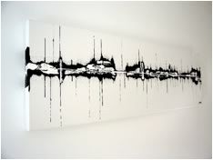
The different spikes of inc form less of a pattern, and more of a rhythm as they progress across the page. It gives a sense of movement and helps direct the eye.
Emphasis:
Sometimes the goal of the previous techniques. Emphasis is an attempt to draw attention to a specific part of the piece.
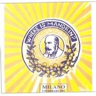
The leading lines as well as the high contrast of color draws immediate attention to the mans face.
Unity:
A sense of place and consistency in art.
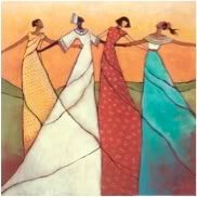
even though these women’s dresses are different color they all have place in the picture to create the overall effect.
Varity:
The use of change to empower the subject.

among all the color and chaos the solid white block draws the viewers attention immediately to the man walking down the street.
Wednesday, October 8, 2008
Reflection on Lumiere
My favorite Lumiere film that we watched in class was by far Beauty and the Creep. It was funny, entertaining, and well shot. The low angle camera drove the voyeuristic theme, which is inherent to a Lumiere film. The rule of thirds was followed almost religiously, which made it very visually pleasing. The situation may have been slightly exaggerated which added to the entertainment but ultimately detracted from the Lumiere esq intentions. One part that particularly stood out was when the main subjects head went off screen slightly adding the voyeuristic feel of the camera.
Making this short film was interesting to me because there was very little “making” involved. I simply set my camera on a chair to give it a lower and slightly skewed angle, and began filming. The most difficult part of production was convincing myself to hit my head against a steel bar…
After the footage was imported all I did was desaturate clip adjust the levels, contrast, and curves to get the tonal values I wanted, and add music. Though adding music detracted from the Lumiere style, I thought it greatly added to the piece and helped set a sense of pace and purpose. Also keeping the audio allows the viewer to hear the “clunk” of my head hitting the bar, which adds to the sensory experience and the impact of the moment. In hindsight I wish that better lit the roof of the bunk so that it would be more visually obvious what I am hitting. Watching the video in class did not bother me though I wish we had more time to turn the viewings into critiques and get feedback from our peers. (Though that’s probably the art class talking…)
Japanese Modern Culture
(I will try to put the pictures in as soon as my photo hosting website is back online... sorry for now) they are in the hard copy.
Since I was very young Japanese Culture has been very interesting to me. The various forms of design vary greatly and there are interesting contrasts riddled throughout the culture. From Japanese architecture to television, they celebrate both sides of the design spectrum equally. From chaotic and “insane”, to extremely organized and simple, various aesthetic approaches are taken throughout the culture.
Currently Japan is one of the world leaders in technological development. This world position is very obvious when looking at almost any Japanese structure. The ultra affordable, efficient, and clean governmentally appointed housing:

is an excellent example of this approach.
Though simple and seemingly very western, the sheer use of space is astounding. An average Japanese apartment building houses twice as many tenants than its American counter parts (in ratio) this resourcefulness is a common theme throughout Japanese culture.
The incredible and borderline “whacky” Capsul Tower Hotel (which is scheduled for demolition):
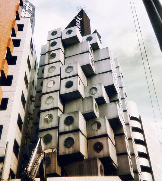
The idea of controlled chaos permeates Japanese culture. While it is commonly found in entertainment this archictural structure reflects it. It makes amazing use of space, contrast, balance, points and lines. Also it emphasizes proportion and unity. These design elements show themselves in other places in the culture as well.
The breath taking Umeda Sky building in Osaka is a great example of this:
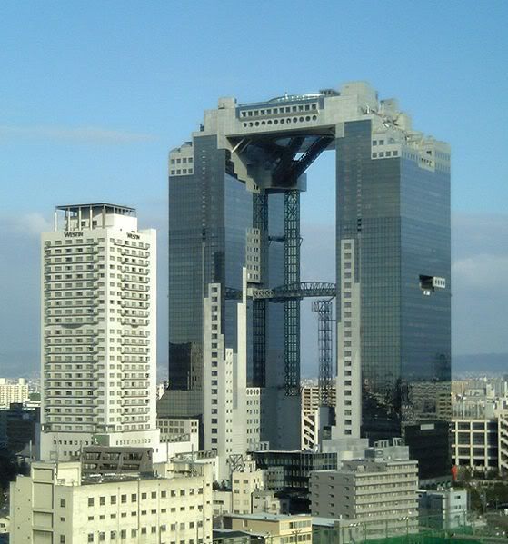
Finally this massive tower demonstrates the Japanese trait of form vs. function and the balance there in. These massive towers visual make amazing use of lines, texture, balance, and form. If similar buildings were built in America at a similar time they would undoubtedly be much more concerned with function and as such lose the beauty.
Japanese architecture is an extremely interesting balance between chaos and simplicity. Also they greatly appreciate both sides of the balance between form and function. This can be seen in many of their technologies.
The Honda Car is a great example of a beautiful, efficient, cheap, and reliable car. It gets very high gas mileage as well as maintaining the sleek and sexy design, which consumers seem to expect of modern cars:

Japanese cars make outstanding use of balance, lines, and curves. Also movement obviously places key rolls in the designing of cars. However, again the Japanese seem to balance form and function perfectly and that is why they are one of the leading car manufacturers.
However, on the flip side while the Japanese make incredible use of their recourses and do not waist when it comes to physically constructing something. Excess and chaos becomes very evident in their advertising and entertainment.
An example of this is Takeshi’s Castle or as known in the United States “MXC” (Most Extreme Elimination Challenge). This show is utterly ridiculous and in very few ways actually reflects the non-wasteful sleek and organized themes that seem to have defined Japanese culture:
.
This hectic game show uses rapid movement, bright colors, and very little balance to achieve the feeling of utter ridiculous that permeates Japanese entertainment. Interestingly though this may at first glance seem negative, the spectator becomes very attracted and “hooked” on watching this type of television for hours on end. In a since their ideas of form and function parallel the idea that in this case the ends justify the means (the ends being viewers watching, the means being chaos).
This Japanese shirt is also a good example of this organized chaos:
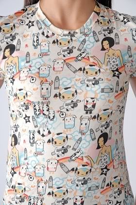
Japan makes excellent use of all different elements of design. The balance, lines, and simplicity that is found in their architecture and technology in many ways contrasts with the chaos, colors, and rapid movement which is found in their entertainment. The idea of excess and waste when it is superficial is very interesting and I believe the Japanese appreciation of this idea may be a key reason to their continued success.
Wednesday, October 1, 2008
Response to Video Scavenger Hunt.
Regarding places to improve I would have liked to see a consistency in the quality of the shots, also a more defined central theme. I understand now that it is wet and dry, however, watching the movie I did not realize this. Also some elements of composition may be improved. For example in the two shot I would have liked to have seen her feet instead of cutting her off at the knees.
Regarding my own film, I thought it was a fun exercise that is useful in developing a visually literate eye. I did all of the work behind the camera as in filming and composing shots. However, Laura regardless of having no prior visual art experienced gave valuable insight when she deemed it necessary. Laura also did almost all of the organizing of equipment (renting the camera and getting tapes).
We both shared in the editing process. Though I did most of the technical cutting and mixing, Laura helped organize the shot lists and order. She also helped decide the duration of several shots throughout the film.
We shot the entire film without a tripod (due to a mix up at the cage) and although it was noticeable at the end during the zoom, it was not a major hindrance in the filming process. In hindsight it would have been more interesting to pick an object that is simply more interesting than a bottle of OJ. However, the simplicity of the object makes the film relatively fun to watch. Also, I wish that I shortened the clips displaying the name of the shots between clips.
The showing of my work did not bother me at all. I have taken part in countless artistic critiques in the past, which varied greatly in intensity and “harshness”. I am proud of my work (if I wasn’t I would not have made it) and greatly enjoy sharing it with people.
I thought this exercise was very useful as a sort of stretch to help me get back into film making after a summer and several semesters off. Also iMovie has been completely revamped and this served as a useful tool in acquainting myself with this newer version.
The Big Lebowski Scene breakdown. scene #20-Ashes to Ashes
In this scene they are not so much mocking death as pointing out the ridiculous and essentially pointless ways we approach it. The two contrasting characters, Walter and The Dude, create an interesting dynamic that essentially play off each other to deliver this grim satire.
After the death of their friend, Walter and The Dude attempt to spread his ashes out across the ocean. When they cannot accomplish even this one simple task The Dude has a “breakdown” and a temporary roll reversal occurs in which The Dude becomes angry and aggressive and Walter attempts to comfort him. This scene is coherent with a larger theme of successful incompetence throughout the film.
Shot breakdown.
1. Medium close up to three shot.
2. Cut out to zoom (still three shot)
3. Zoom to medium close up
4. Cut to medium close up (repeat)
5. Scene break
6. Establishing shot (two shot)
7. Medium two shot close up to long shot
8. Back to medium two shot
9. Cut out to over the shoulder back to medium close up.
10. Cut to medium close up 2 shot to three shot (coffee can)
11. Over the shoulder. Cut to medium close up repeat.
12. Cut to medium shot
13. Scene
Mis-En-Scene
The Mis-En-Scene that is seen in this clip from The Big Lebowski is very consistent with the rest of the film. Though makeup is not readily noticeable on the characters, their costumes are direct representations of their personalities. Walters’s eccentrically conservative attire reflect him perfectly, while The Dudes laid back bowling garb is a perfect representations of him.
The shots themselves are usually very “big and empty”. What this means even though the shots are wide (in this case including a vast ocean and huge cliffs) the only thing relevant are the two characters having a dialogue. The film also makes ample use of the rules of thirds, leading lines, vanishing points, and natural frames. This makes it very easy and fun, easy, and interesting to watch.
Though in other scenes the lighting is used to create a specific desired effect. This scene makes good use ambient natural light. This technique is a reflection of the nature of the scene itself.
Wednesday, September 24, 2008
Lumiar film
The script:
A boy is laying in bed for around 20-30 seconds. Suddenly he sits bolt upright slamming his head into the bar beneath the top bunk. He immediately collapses bank into a laying position where he lays for around 20-30 seconds.
Black and white
Mute
the Movie:
3 Tasks
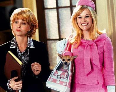
The shot above is from Legally Blond…
1. It appears that the woman in black is introducing the woman in pink to a character off screen to the left of the camera.
2. In this picture we roughly assume the view of the person who the two characters in frame are meeting or speaking to. Assuming there are only three people in this interaction there are three different points of view.
3. It appears they are meeting someone knew. Perhaps they are about to enter a meeting or an appointment. The woman in black seems to be a guide or at least seems to be guiding the woman in pink. The woman in black may leave after introductions are made.
4. The woman in pink is obviously extremely excited to be in the situation or to meet the person she is being introduced to. The woman in black is a humorous contrast with a serious yet “why me” look on her face. However, her face also hints that she is knowingly oblivious to the flamboyant nature of the other woman.
5. They both seem to have the same emotional reaction. However, their different characters display this reaction in radically different ways. One reserved and the other extravagant and flamboyant.
Script…
B: “This is Mary she’s the newest member of the team. She will be joining the case in full force as soon as she finishes reading the briefings.”
P: “Actually I’ve like already finished reading the briefings! Like super innocent if you ask me.”
B: “What? YOU’ve finished reading the briefing? It was almost four hundred pages long! I only gave it to you this morning.”
P: “I know! Im super sorry! Like this guy called and I ended up talking to him on the phone for like three hours! I promise I wont take this long again!”
B: “Uhh, good… Anyway, this is Mary she’s the newest member of the team an-..”
P: “Im super excited to be on board with this! I cant wait to work with all you fab peeps!”
B: “and apparently she can get to work with you right away…”
P: “like thanks so much miss B! Lets do lunch like super soon!”
B: “I can’t wait…”
P: “Luv U!”
Question #2
Scene-
The Big Lebowski- Over the line
While this dialogue between Walter and “Smokey” follows a linier and coherent timeline the director makes great use of cuts to keep the fluidity of the scene intact.
The camera bounces back and forth between the characters Smokey and Walter. In the beginning of the scene Smokey is far from the camera and Walter. However, as the scene progresses he moves in toward the camera. His movement stays constant whether the camera is on him or not. His movement is implied and not directly shown. However, the viewer knows it takes place despite it being off frame. For example when the camera cuts from Smokey to Walter, and back to Smokey he is closer than he was in the previous frame. This creates the illusion that the scene is progressing at a normal rate. Also the pans of the camera move with the camera and do not halt even when the shot shifts to Walter. This also creates the illusion of movement. Also the camera never leaves one side of the 180* line drawn between the two characters. The cuts become more rapid and tighter as the tension in the scene heightens. This gives an extra element of tension. The choppiness is broken by a steady long shot of the entire situation, which essentially serves as a period at the end of the situational sentence.
Question #3
Movie-Titanic
1. Aside from the obvious (Garb, language, etc) the movie Titanic is a strong display of the mentality of the time: Progress for the sake of progress. Form and function gave way to grandeur and unchecked egotism. Titanic portrays this mentality through the actions of the characters.
2. The main historical group portrayed in titanic is the British. Specifically the wealthy upper class. The film itself depicts these bourgeoisies in a negative accusatory light, it does not simply let their actions make these accusations.
3. The political and social repercussions immediately after the tragedy. Or even a more macro look at the event rather than simply the focus on the lovers.
4. In order to appeal to a wider audience. (Film making is a business at the end of the day) Also a more coherent story line.
5. The film gives an accurate technical depiction of the events. And a realistic depiction of the human emotions during the sinking. However, it should not be viewed as a scientific document in the least.
Tuesday, September 23, 2008
papers...Papers....PAPERS!!!
Felix Penzarella
Prof. Kimberly R
9/23/08
Visual Literacy
Blue
The exhibit “Blue” was very appealing for various reasons. While it gave an informed history of the color indigo and the plant it is derived from, this was not the main attraction. Instead, the wide range of industries and mediums that make effective use of the blue tone is what was truly amazing.
The first and arguably most recognized use of indigo (as displayed at the exhibit) was blue jeans. While this seems obvious and mundane, it played a key roll in the exhibit as a contrast for the other more exotic uses. The use of blue in our clothing is the most modern culturally rooted example of blue and thus served as an anchor for the color when viewed in more exotic mediums later on in the museum.
While the jeans seemingly lack artistic value or merit, other examples of indigo certainly do not. The primal yet intricate pre-Columbian native weavings, which depict animals, are amazing in their detail. This is particularly impressive considering the tools they used to create the weavings were primitive at best.
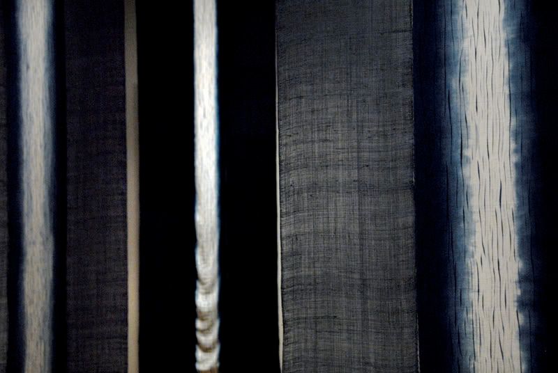
The native weavings and primitive artwork stands in stark contrast with some of the larger more exciting pieces in the exhibit. The work of Japanese artist, Hiroyuki Shindo was particularly impressive. His massive installation pieces used symmetry, balance, various lines, and even interesting contrasts to convey the mood that his pieces intended.
The color blue inherently invokes a calm, collected, and cool feeling. The Japanese artist built upon this trait to construct his massive instillation piece. Hanging cloth is always moving slightly due to air movement, while large balls of blue twine lay seemingly askew on the ground. This contrast is between the solid spheres and the fluid drapes and it creates a sense of tranquility, calm, and balance.
Other pieces in the exhibit included a large box constructed with cloth that was intended as a tea drinking room, a wall hanging with intricate and elaborate designs, and a set with a chair contrasted against a fluid blue cloth backdrop. While all these pieces made effective use of the color blue and its inherent calm provoking tones, none compared to the deep psychedelic effect that Hiroyuki Shindo’s piece evoked.
Overall the exhibit was very interesting. While I have always been aware that blue evokes a feeling of calm. The exhibit made that feeling more real than ever before. From the flower to the tapestry “Blue” showed blue in a light I have never before seen. The exhibit granted me a new appreciation for the color, which I can only hope to emulate in my own art.
A photograph that I took at the exhibit of Hiroyuki Shindo’s piece is above.
Wednesday, September 10, 2008
Realism
Russian Ark: The Reality of History
The film Russkiy Kovcheg is not only one of the greatest realist films I have ever seen, but is also one of the greatest feature length films I have been able to enjoy. Directed in 2002 by Aleksandr Sokurov Russkiy Kovcheg is widely regarded as one of the most technically impressive and innovative films ever made.
The words Russkiy Kovcheg are Russian for “Russian Arc”, a title that is arguably more important to the film than any line of dialogue it contains. However, it is not the dialogue that makes this film so notable. Instead it is the cinematography that dominates the viewers mind. The entire movie is filmed inside of the Russian State Hermitage Museum and the shots that are created there in are absolutely breath taking. However, the most amazing thing about the shots are not their crazy camera angles or “Hitchcockian tricks”. Instead the fact that there is only one shot that makes this movie so impressive.
The entire ninety minute film was shot in one continues take. The cameraman, Tilman Buttner, operated a steadicam and walked through the entire museum shooting the scenes along the way. In total there were over two thousand actors and almost a thousand more crewmembers. It is to date the longest single shot ever taken in a feature length film.
The story itself is very strange. An unnamed main character that is voiced by the director makes his way through the Russian State Hermitage Museum and along his way witnesses three hundred years of Russian History. The two thousand cast members who are dressed in garb reflecting their respective time period reenact significant and at times obscure moments from Saint Petersburg’s vast History.
The film is an extremely patriotic tribute to Russian History and is at times hard to understand or relate to. However, the sheer scale and craftsmanship that is Russian Ark is more than enough to blow away cynicism.
The realist element of the film is very strange. Unlike many realist works the techniques employed may be seen as avant-garde, however, the film as a whole bares very little resemblance to other pieces in the same category. It does not have an “art film” feel to it; in fact the cinematography is so strong it might be viewed as somewhat commercial or “mainstream”.
The realist element of Russian Ark truly shines in the story in conjunction with the cinematographic technique. The story is that of Russia. The actors are simply the Russian people and though the film does show key figures such as Kathrin the great, it also shows the Russian serfs and peasants in an equally significant manor. Beside the main character through who’s eyes we are watching the film unfold and his traveling companion “The European”, no one character stands out as more or less important than anyone else.
The one continuous shot technique is very effective in making this a realist piece. Without it the film would lose its strong sense of continuity and become simply hard to watch. The single long shot also is a narrative device in and of itself. It represents the perseverance and continuum of Russian History.
Another very realist element of Russian Ark is its focus on people. While the film is shot in one of the greatest Russian buildings ever constructed it only servers as a backdrop for the people of Russia to act out they’re History. It is Russian people portraying Russian History. No special effects or narration, the story is told through very basic dialogue and visuals. The energy of the film comes from the people’s interaction with their History.
In conclusion I would call Russian Ark or Russkiy Kovcheg an extremely successful film. From cinematic quality to emotional drive the film delivers strong. As a realist piece it is also extremely successful and through one of the most challenging cinematic effects it brings realist film making to another level. While the film seems slow at times the lulls serve their own purpose of “proving reality” another realist technique. Russian Ark is simply put, “breathtaking”.
