Advertisement critique
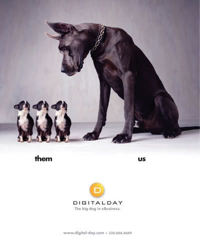
The add I chose belongs to the web hosting and business trading cooperation, “DigitalDay”. While the add gets the point across effective I feel that it lacks the originality needed in order for me to consider it a “standout add”. However, what it lacks in originality it makes up for with clean, crisp, and simple ascetics.
The first thing that I notice when looking at the picture is in fact the smaller dogs. While my eye might naturally fall upon the larger darker animal, I immediately follow its gaze down to the smaller more pathetic dogs. I do this so quickly that I do not take the time to consider the larger animal until I have spent some time looking at the more squat ones. Also this effect may be attributed to poor planning on the designer’s part. The eye naturally reads left to right and as such the subject should have been framed to the left. However, there may also be very subtle and purposeful planning behind this choice of off balance in the picture.
Because the eye reads left to right we end up fully considering the larger dog last, this may be intentional as in this way the dog serves as a visual punch line and as such the company that it metaphorically represents is remembered more and more prominently than the smaller animals (their competition). The dark to light spotlight gradient in the background servers to add a sense of direction to the picture and to help make the already noticeable dog even more prominent.
However, this is wear the advertisement begins to lose value. Simple poor processing caused the gradient to end abruptly in a straight harsh line. Instead of choosing to fade the cut off point between the stock photograph and the text beneath, they chose to simply place the photograph and add the text. The lack of integration between the top and bottom halves of the picture greatly detracts from the overall effectiveness of the advertisement.
The text bellow the picture is essentially an explanation of the metaphor and as such detracts from the “punch” of the add. Without the text the viewer would feel slightly more engaged because of their effort to understand the meaning of the advertisement.
The semiotics of the advertisement is effective. The image (and idea) of one larger dog compared to the group of smaller silly looking dogs inherently makes the viewer feel that the larger dog is obviously better, and transitively the company is better. Also the fact that it is one solo dog against a group of dogs conjures the idea that the company rises above the pack and in this case the competition and stands out as the best.
The advertisement is effective. However, the inclusion of the “us,them” words detracts from the “punch”, the picture gets the message across and catches the eye of the viewer, and in the end, that’s the point.
No comments:
Post a Comment